Designing Accessibility into Symphony
Symphony is a collaboration platform for the finance sector offering encrypted, chat-based communication and other workflow solutions. Symphony’s initial product had not been built with assistive technologies in mind, and they were failing blind and visually-impaired users.
We needed to make the Symphony 2.0 product accessible to continue our contracts with high profile customers.
Role
I was the lead design resource for accessibility and worked closely with a knowledgeable product manager.
Project Goal
Ensure that visually-impaired users could complete the same tasks as non-impaired ones across the entire product.
Project Process
—
Gather requirements
Generate persona from research
Create team-wide guiding principles around accessibility
Apply principles to components (e.g. buttons)
Evaluate the existing application for WCAG conformity
Create tools to help other designers ensure success
1. Requirements
—
Our customers needed Symphony to conform with the Web Content Accessibility Guidelines (WCAG)’s AA standard.
There were earlier efforts to make sure our color palettes met this standard, but in the grand scheme of accessibility, color contrast is a small portion of compliance.
Symphony 2.0 was expected to be accessible at launch. My immediate focus was to get accessibility materials in front of designers.
Color is the first thing most folks think about when they hear the word “accessibility.” Shown here: an accessible color palette for Symphony 1.5.
Before accessibility principles had been applied, Symphony 2.0 was not easily navigable via keyboard.
2. Persona
—
The biggest challenge for me and my team was realizing how much the user was not like us. I modified an existing persona to fit our use cases and keep us focused.
Persona borrowed from “Meet Jacob” from A Web for Everyone by Sarah Horton and Whitney Quesenberry
3. Principles
—
To stem the tide of inaccessible designs, my product manager and I created seven principles to guide the team.
Landmarks
Tab order
Avoid popups
Differentiate decorative images
Include descriptive texts for screen readers/assistive technologies
Contrast ratio
No automatic implicit changes


4. Components
—
While leading this effort, I updated the component library for Symphony. From keyboard interactions to color, I had to consider how each component would meet the WCAG criteria.
For simple components like text fields I focused on achieving proper contrast across all possible states. I showed how Jacob would interact with the components to execute a workflow.
Complex widgets like the calendar could be more creative but also documentation-heavy.


5. Application
—
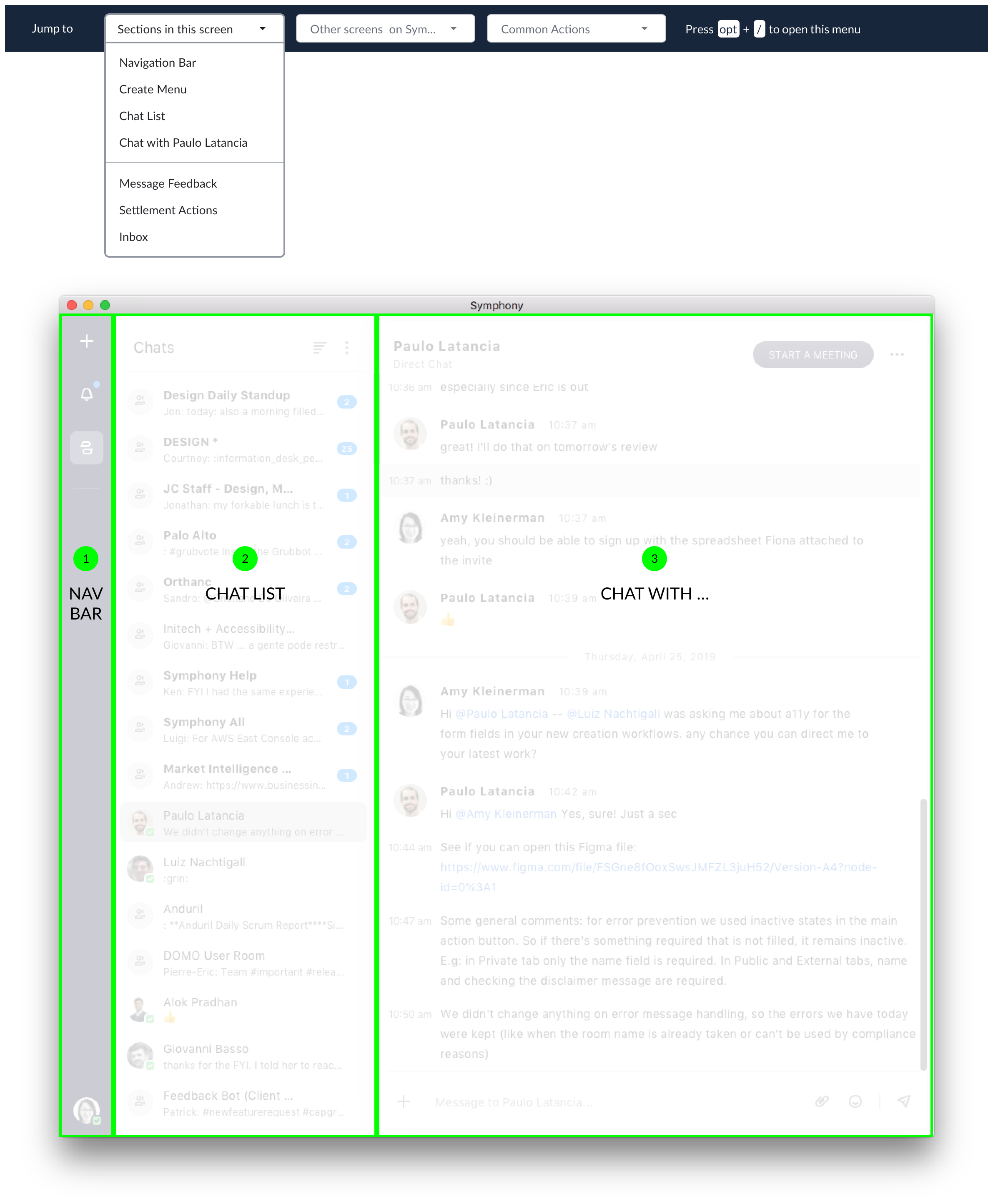
Jacob needed a way to navigate landmarks. We added a keyboard shortcut that brought up accessibility tools. He could use this toolbar to jump to a landmark rather than traversing the entire app with the tab key.
For each landmark I wrote detailed interaction notes. For this chat list I detailed the keyboard interactions and audio descriptions.

6. Tools
—
The design team needed tools to work through basic accessibility problems on their own. I created a checklist to connect the principles to their work.
To test the checklist, I worked through it with a designer on my team.


7. Conclusions
—
This project forced me to think about the user experience beyond what users see and tap or click on. Designing for Jacob resulted in a better experience for all Symphony users. Though I was unable to see my work through to the launch of Symphony 2.0 I learned a great deal about accessibility and educating others. I felt I left the team well-positioned to succeed.