Adobe Target Recommendations Redesign
Adobe Target helps marketers optimize their content via A/B testing and machine learning. The product was losing market share to competitors because it was difficult to set up and use. To combat this, leadership pushed to improve the user experience by making setup a single line of code and making test creation visual rather than form-based.
Role
I led the end-to-end redesign of Recommendations, the last segment of Target needed to hit feature parity. I was supported by my design team, product manager, and a remote engineering team.
Project Goal
Make the task of creating a recommendation clearer, easier, and consistent with the rest of our redesigned product.
Project Process
—
Gather background and requirements
Set project North Star
Establish key components and workflows
Create product workflow
1. Background
—
A recommendation is a custom-generated list of content. Like other content optimizations within Target, it helps marketers drive up metrics like revenue, conversions, or time on site.
On the far right of Nordstrom.com’s product detail page, an example of a column-style recommendation for items “People also viewed.”
Recommendations engines use visitor behavior to relate products to each other. When building a recommendation, marketers need the content that shows up to feel personal, but too many rules may result in nothing showing up.
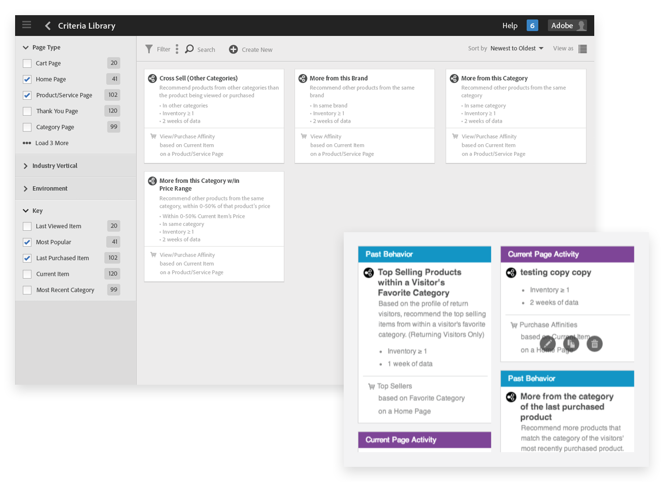
The legacy Recommendations interface was entirely form-based.
Recommendations are generated by combining lots of moving pieces, each a potential point of failure. The legacy version of the product puts all of those complexities on display.

2. North Star
—
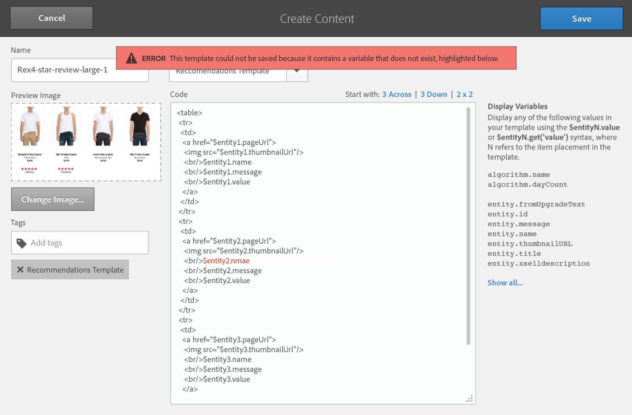
Target needed to provide guidance and good defaults for marketers. These would increase their chances of success and reduce the potential for errors.
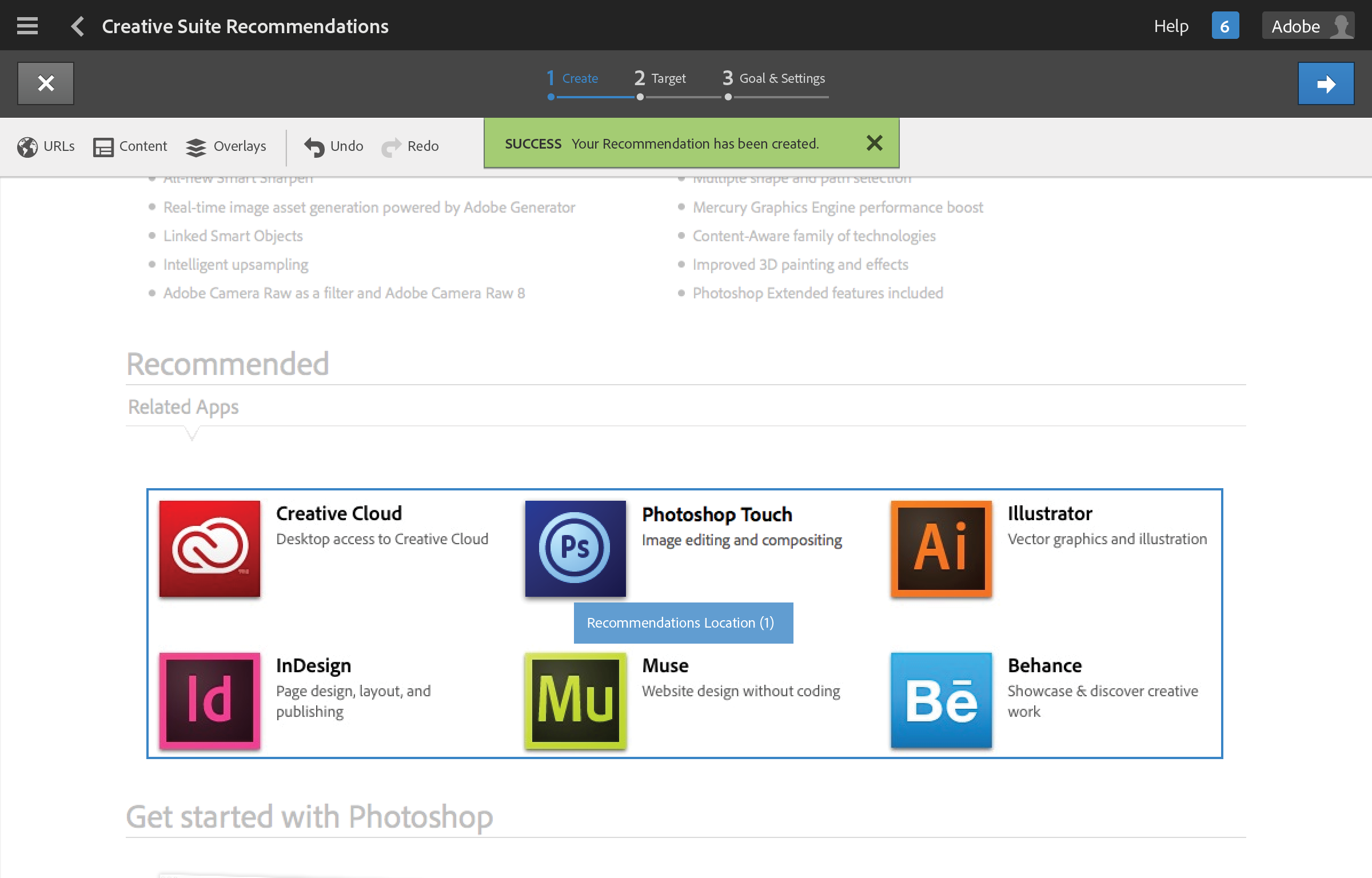
A successfully-created Recommendation within Adobe Target.
3a. Components
—
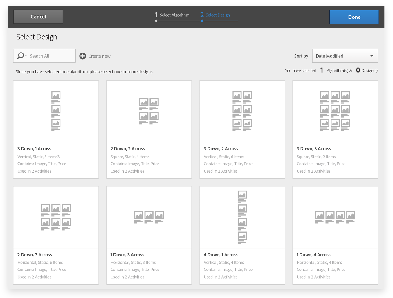
To provide good defaults, my product manager and I explored pre-packaged algorithms and layouts that marketers use right away, rather than having to build from scratch.
3b. Workflow
—
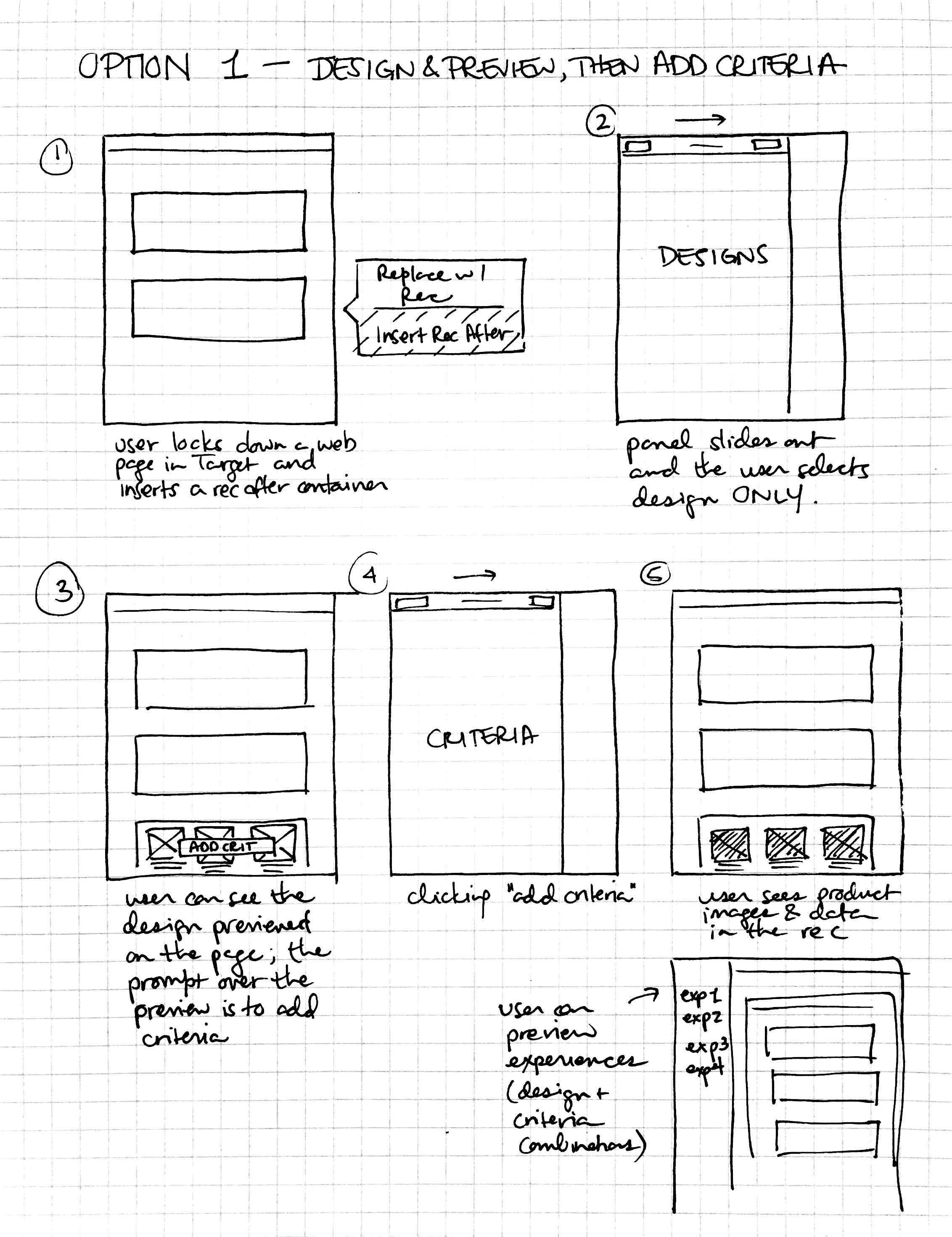
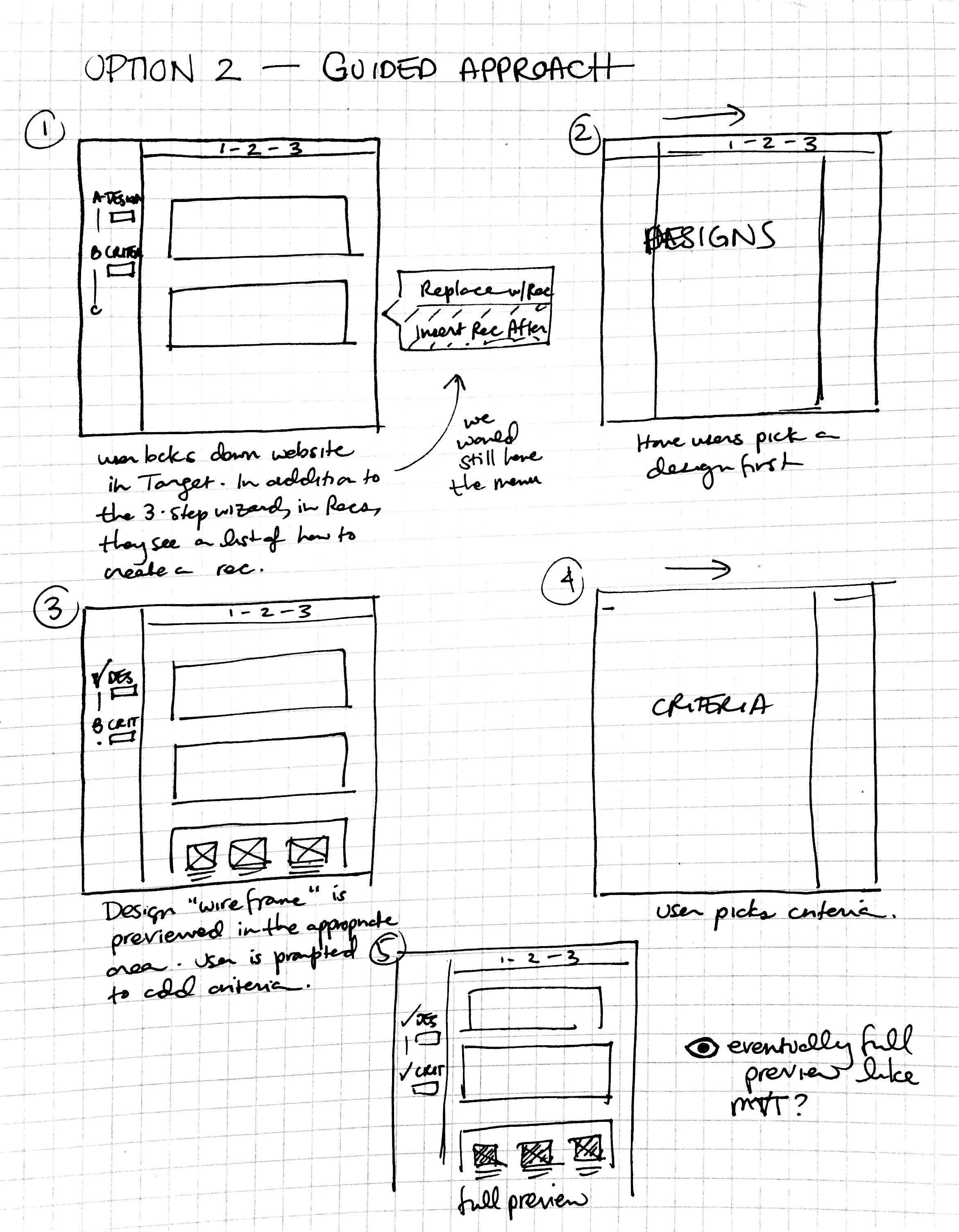
Next, I sketched out how marketers could create a recommendation from start to finish. I pushed for a guided approach, exploring both a multi-step process and a wizard.
To reduce the number of transitions for our users, I focused on the wizard-driven approach. Marketers would select algorithm(s) then layout(s), previewing their results at the end. The simplified flow below shows a “happy path” scenario.


4. Conclusions
—
Over the course of a year, I succeeded in my mission to help marketers more easily create Recommendations.
This project took about a year to complete due to its scale and complexity. My redesign resulted in happy users at our Customer Advisory Board. At the time, we were limited in our access to actual users, and I wish I could have tested it more along the way. Looking back, there are also some details of labels and language that don’t feel right, and if I had to do it over again I would have pushed harder to change them. Still, I am happy with the workflow we eventually landed on.